Going To Extremes
Extremes of Scale
When I think of extremes of scale, this conjures up an installation looking to engulf the visitor or make them walk through a hot flush or create an imaging of how the heat rises and is all empowering for a time.
 |
| Christo wrapping monuments - in Milan |
I also was really interested in Shivani Aggarwal's work and her use of scale and colour. The red she uses on large everyday objects makes people stop and ask is the reason for this and what do they want to say. Her ideas are about distortion and by creating large exhibits her thoughts become more prominent and resonating.
 |
| Article from Sculpture about Shivani Aggarwal's work |
My ideas are more about the feel of the materials being accessible to touch by the onlooker. Or the materials touching them as they walk through.
One of my thoughts was about a tunnel. There is so much talk about 'going through' the menopause I was thinking of abstract ideas about how the onlooker could 'go through' the exhibits.
For instance, going through a tunnel with crochet pieces representing hot flushes and night sweats in a 24 hour period. Or going through an imaginary door to see what is awaiting through it. Or again using the idea of breaking down taboos breaking down the menopause wall.
 |
| The menopause tunnel |
All these ideas are larger ideas and would be to gain maximum impact within the gallery space.
I also thought of large wall hangings where people can add their thoughts on the menopause to the hanging buy sewing or adding a piece of textiles with a safety clip. When this would become full, other wall hangings are created with other symptoms of the menopause so people can be interactive with them and also learn from other's experiences and the feeling they are not alone.
I also thought about Taboo and why we have to break it down and then thought of where there is a lack of voice for a women and how this is created and sustained in society.
My ideas are both under the extremes of scale, audience and meaning. I researched existing men only clubs in establishment circles. As often breaking taboos have to start with the establishment and then work downwards to everyday society.
There is also an idea about challenging the norm. Why is a very natural point in a women's life a taboo ? What makes it taboo ? I want to challenge the establishment and existence of 'bastions' in society which are allowed to help maintain areas of taboo. I took the Gentlemans' Clubs as swathed them in reds and pinks to illustrate the hot flush.
 |
| The menopause wall |
I also thought about Taboo and why we have to break it down and then thought of where there is a lack of voice for a women and how this is created and sustained in society.
My ideas are both under the extremes of scale, audience and meaning. I researched existing men only clubs in establishment circles. As often breaking taboos have to start with the establishment and then work downwards to everyday society.
There is also an idea about challenging the norm. Why is a very natural point in a women's life a taboo ? What makes it taboo ? I want to challenge the establishment and existence of 'bastions' in society which are allowed to help maintain areas of taboo. I took the Gentlemans' Clubs as swathed them in reds and pinks to illustrate the hot flush.
 |
| Whites Men Only Club bathed in gradients of pink and red - challenging that people are ignoring the menopause. |
 |
| Brooks Gentlemans' Club bathed in pinks and reds to represent hot flushes |
 Another of my thoughts of scale was to scale up from reality and create something that could be worn, wrapped round. The crocheted 'ovary' shawl is not full scale but it gives an idea of what I was thinking about.
Extremes of Pattern and Colour
To me the colour palette feels very extreme, I do not normally work in pink and reds and I feel quite vulnerable doing so. I am not sure why this is. Therefore the colour palette I am working is extreme and unnerving, it lacks subtlety and is quite coarse in areas. However I think it does help to ensure it is striking and really fits the subject matter.
When I got a lot of inspiration from the Bridget Riley exhibition I went to recently in Edinburgh. I realised keeping to the colour palette I could create interesting abstract paintings which could lead on to weaving and crocheting in this way.
When I got a lot of inspiration from the Bridget Riley exhibition I went to recently in Edinburgh. I realised keeping to the colour palette I could create interesting abstract paintings which could lead on to weaving and crocheting in this way.


Bridget Riley produced a lot of her work in monochrome, however when she did introduce colour it was very tightly kept to the palette she worked out in her preliminary work. Aiming to create a specific look and feel to her work she used very limited patterns to give maximum effect to the pattern design and show how the colours interlock.
 I wanted to create geometric shapes to give a different perspective of the hot flush, creating patterns which show the heat building up and radiating over areas was of interest to me in my work. By using embroidery to replicate my sketches and painting I felt these patterns related more to a women's body.
 The extreme of colour was difficult for me to establish at first as these are by no means my favourite colours. However in order to get over my representations they are my colour palette and this has meant that I have challenged myself with how to use them and get the best from them.
 The pinks and reds are used to represent something unpleasant for women which is not really what the colours are normally used for. I have to be careful with the use of colour to ensure that my work doesn't look too obvious as pink is not used to represent femininity or gender. These colours represent the feelings that women have within their body when experiencing hot flushes.
Extremes of meaning
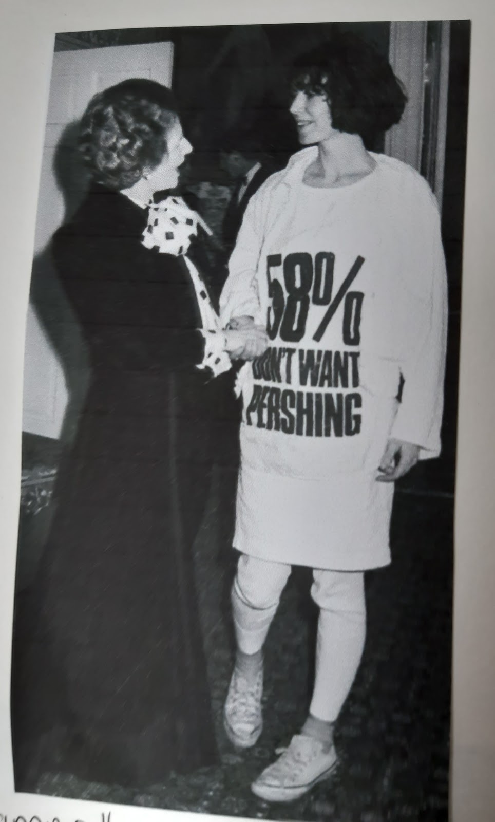
I picked extremes of meaning from the list as I wanted to create some abstract art but also wanted to use phrases or words in may art too. I wanted to use plain white t-shirts to see how the hot flush built up around the body and my idea is that I would embroider or paint on the areas where the flush starts and how it engulfs the body.
 |
  Blouse and headscarf by Bianca Mosca for Jacqmar from a 1942 print called 'London Wall Design'. Blouse and headscarf by Bianca Mosca for Jacqmar from a 1942 print called 'London Wall Design'.The design has slogans stuck on the brick wall about WWII. |
So I have been thinking about how the menopause taboo was formed and how to break it down which quick slogans.
 The number 51 represents the average age of a women going through the menopause so I have used this in several of my samples, through the multi layering of crochet squares in different shades and hues of my colour palette, to the slogans on t-shirts.


 I want the slogans to challenge preconceptions and help talking about a subject that needs to be discussed for the health of generations.
Some of the ideas of slogans are from thoughts of how the older women is viewed in other societies. In those societies women are revered for their knowledge and gain a great deal of respect.
Unfortunately this way of looking at older post-menopausal women is not common in the UK and alot of western culture today. Therefore the slogan can challenge this way of thinking. It can also encourage the women than not all is lost and there can still be rewarding years for the post menopausal woman.

These ideas of slogan t-shirts, can be embroidered or screen printed and my ideas would be in the colours from the colour palette to make them stand out more.
I really liked this project as it was quite scary at first to think of ways of going to extremes, but the more ideas I had the more they lead on to one another. I have gained quite a few ideas on how to move my ideas in the sketchbooks on to other ways of creating installations and ideas.
No comments:
Post a Comment
Note: Only a member of this blog may post a comment.